Vintage Lenormand, the Review

The Review
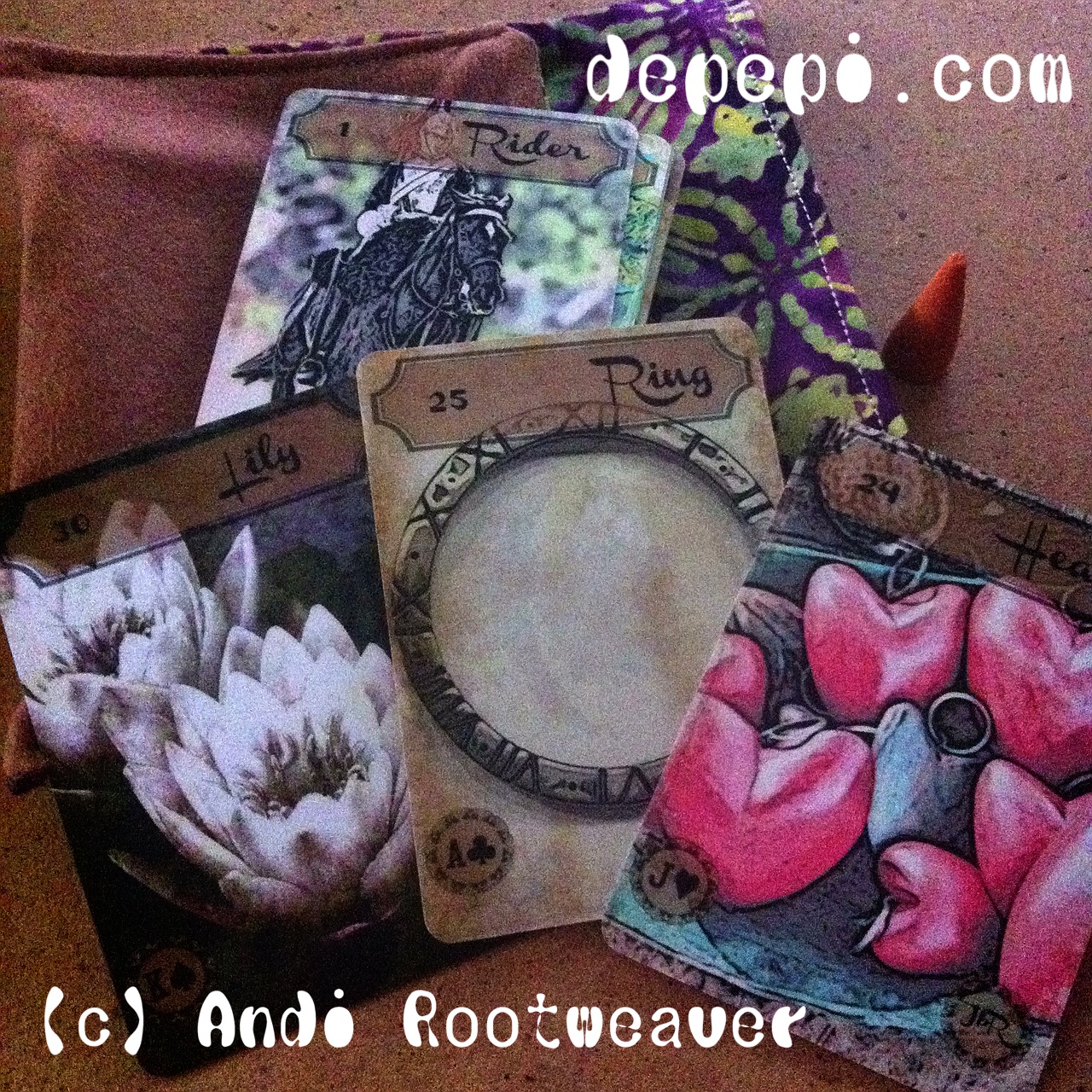
I’m sure that you already know Jera-Babylon Rootweaver (Andi Rootweaver)’s Vintage Lenormand. But maybe you have not noticed some of its key ingredients. This is a Western and yet Oriental Lenormand which makes you go beyond what conventional Lenormands would ever do. I love “oriental” styles, specially if they remind me of Japan. This deck has that. Both photography (Aileen Arnold from UK, Ryan Joffe from South Africa, Ray Theron and Russel White from Australia), colors and the final design make you enter into a different world when you read the cards. Honestly, this modern vintage style is one of the best I’ve ever seen. It looks so fresh, so new, and yet, so vintage that no one can resist its appeal.
The style is unique, and seems to have been achieved using Moku Hanga and photoshop, achieving a very oriental look, very Japanese look (which I personally love). Moku Hanga is an application (for Mac) which is based on the art of Japanese Woodblock printing.
One of my favorite cards is the Heart. It makes me think about Christmas and the type of garments you use to decorate your tree, or your walls. It also remembers me of those small details that young couples give to one another, like a small key holder. The bright strawberry color is not cheesy at all, instead, it keeps you calm and sound. Another of my favorite cards is the Fish. It remembers me so much of Japanese lakes and their fishes. Good memories that bring me back to a place that I love.
This deck has balanced colors, bright and vintage, that create the perfect atmosphere for a deck which is at the same time modern and vintage. A difficult balance to achieve, and yet it seems so natural in this deck. Plus, it has all the traditional Lenormand elements to read them comfortably if you want to use them.
The deck is perfect for both beginners and pros who wish to use a great deck with their clients, or with themselves for meditation. Meditating with this deck is just perfect. It both creates the paths to find what lies in nowadays present and yesterdays past. Again, compelling you to go beyond the normal Lenormand. This deck is strong. You can use it as much as you want. It is smooth and perfect for being shuffled. It is good printer studio’s printing and paper stock quality.
In short, this is a must-have deck. It comes with a cool kangaroo pouch and incense! (I love the pouch). You need this in your collection, seriously. You can buy it here.
The Art behind
As I said before, this deck has been made with Moku Hanga and Photoshop, with extremely good photographs. Aileen Arnold (UK), Ryan Joffe (South Africa, Ray Theron (Australia) and Russel While (Australia) are the photographers. All the digital artwork has been created by Andi Graf (Jera-Babylon Rootweaver).
This is not an easy result to get. If you take a closer look to the card you’ll notice the consistency of colors, outlines and fonts. Even the fonts remind you of the “orientalism” in the deck, mimicking Shodo (the art of writing Kanji with a brush). This means hours of work, not only selecting the photographs, but also working on the computer!
I like the vintage smooth colors which create a quiet atmosphere, which is key in readings. This is a “quiet” and yet “compelling” deck. It smooths the reader, and it shocks the reader. Why? Because of the combination of western and oriental styles. While the artwork is oriental, the photographs are obviously western, except, perhaps, the card of the Lady and the card of the fish, which depict a Chinese Lady and some Japanese fish.
Even though the artwork portraits a “traditional deck”, if you look closer to it you’ll find transgression in it. It depicts nowadays characters in a very compelling way: in a vintage way. Your brain is shocked by these contrasts all the time: western and oriental, vintage and new, traditional and transgressor. This is why the artwork is going to catch your attention from the very first beginning.
Every picture, every card is a poem, a small liaison between what at first sight seem contraries. This is a great “yin and yan” work. A masterpiece.
You can find more information about this deck in dePepi Magazine may-june-july 2013.
—
You can read the original post here.


